0%
A Figma-native design system
One reusable language for an AI hiring experience.
Built in FigmaVariablesComponentsPatterns
Scroll to inspect
The system at a glance
Quiet foundations.
Serious range.
The library pairs a restrained neutral interface with a focused blue brand signal, semantic product states, compact enterprise components, and a separate visual language for AI moments.
77Color variables
16Spacing variables
13Radius variables
18Type styles
01 / Logo
One signature.
Multiple contexts.
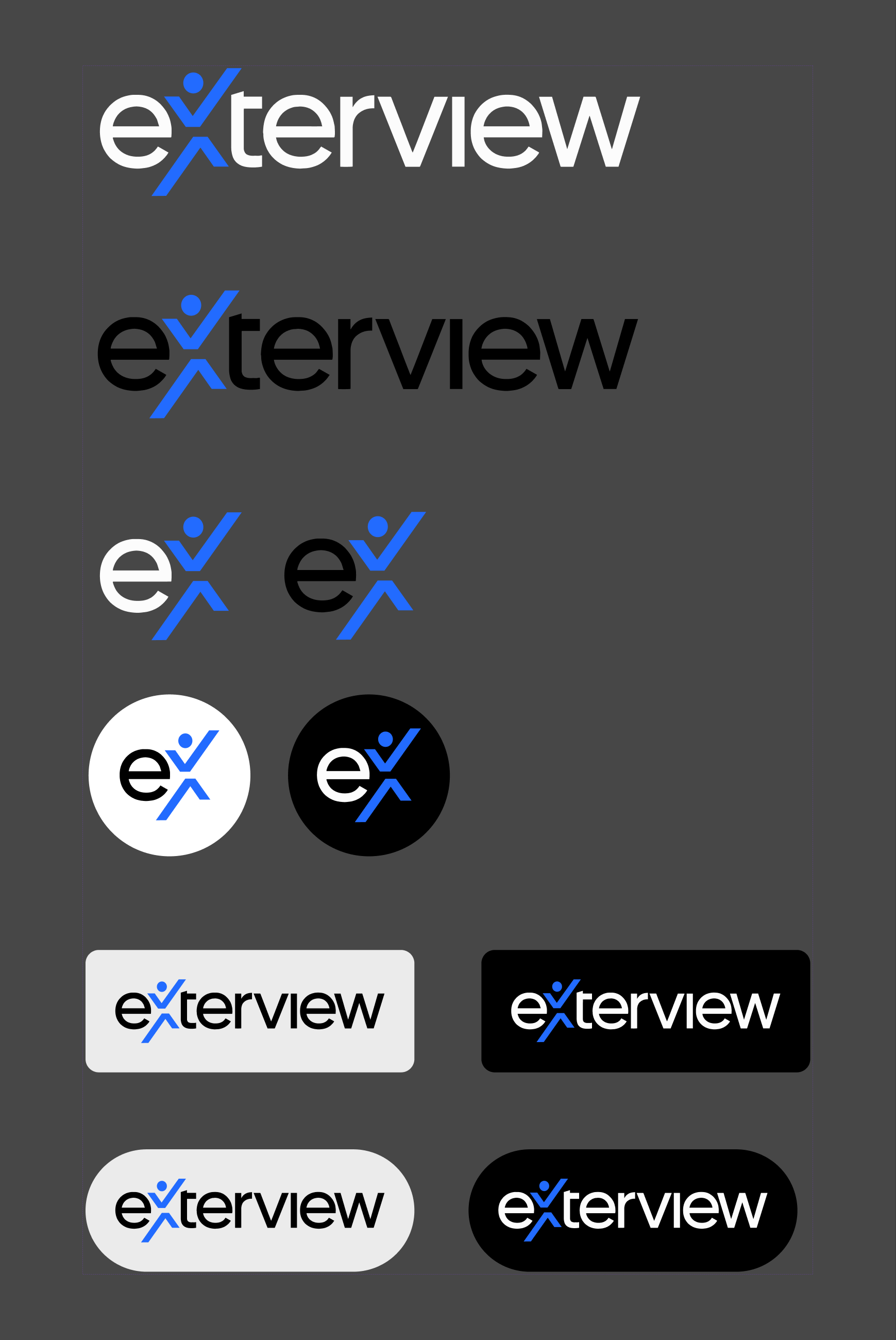
The full wordmark leads the brand. A compact symbol carries the same identity into tighter spaces, with light and dark treatments ready for different product surfaces.
Full signature / Dark surface
02 / Colorography
Color carries
product meaning.
The palette moves from a focused blue brand signal into neutral interface roles, semantic feedback, campaign statuses, chart colors, and a distinct gradient language for AI moments.
brand/blue
#226BFFtext/primary
#292524bg/card
#FAFAFAbg/hover
#F0EFEDborder/light
#E7E5E4error/solid
#DC2626success/solid
#16A34Ainfo/solid
#6366F1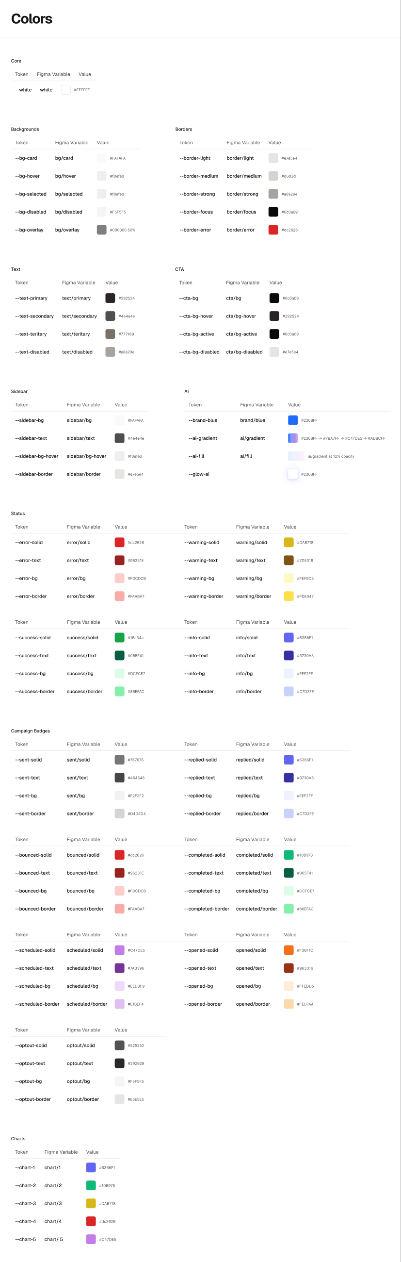
03 / Token architecture
From reusable values
to product decisions.
The Figma file organizes the foundation into three collections, then names colors by interface purpose and product meaning. That makes the system easier to navigate than a palette of raw hex values.
01Collections
Reusable foundations
77 Colors16 Spacing13 Radius
02Semantic groups
Names describe intent
bg/cardtext/primaryborder/focuscta/bgcampaign/sentchart/103System output
Components and patterns
ButtonCardData TableSidebarCharts
Verified boundaryThis view reflects the collections, naming groups, and components visible in the supplied Figma file. Alias relationships will be added only after they are confirmed in the documentation.
04 / Typography
Geist does the
heavy lifting.
The type system moves from a 56 pixel display style to compact captions and controls, with Geist Mono reserved for technical data.
Display / 56 / 59 / BoldHire with clarity.
Body / Geist
Reusable decisions turn complex hiring workflows into one coherent product experience.
Technical / Geist Mono
campaign/status/sent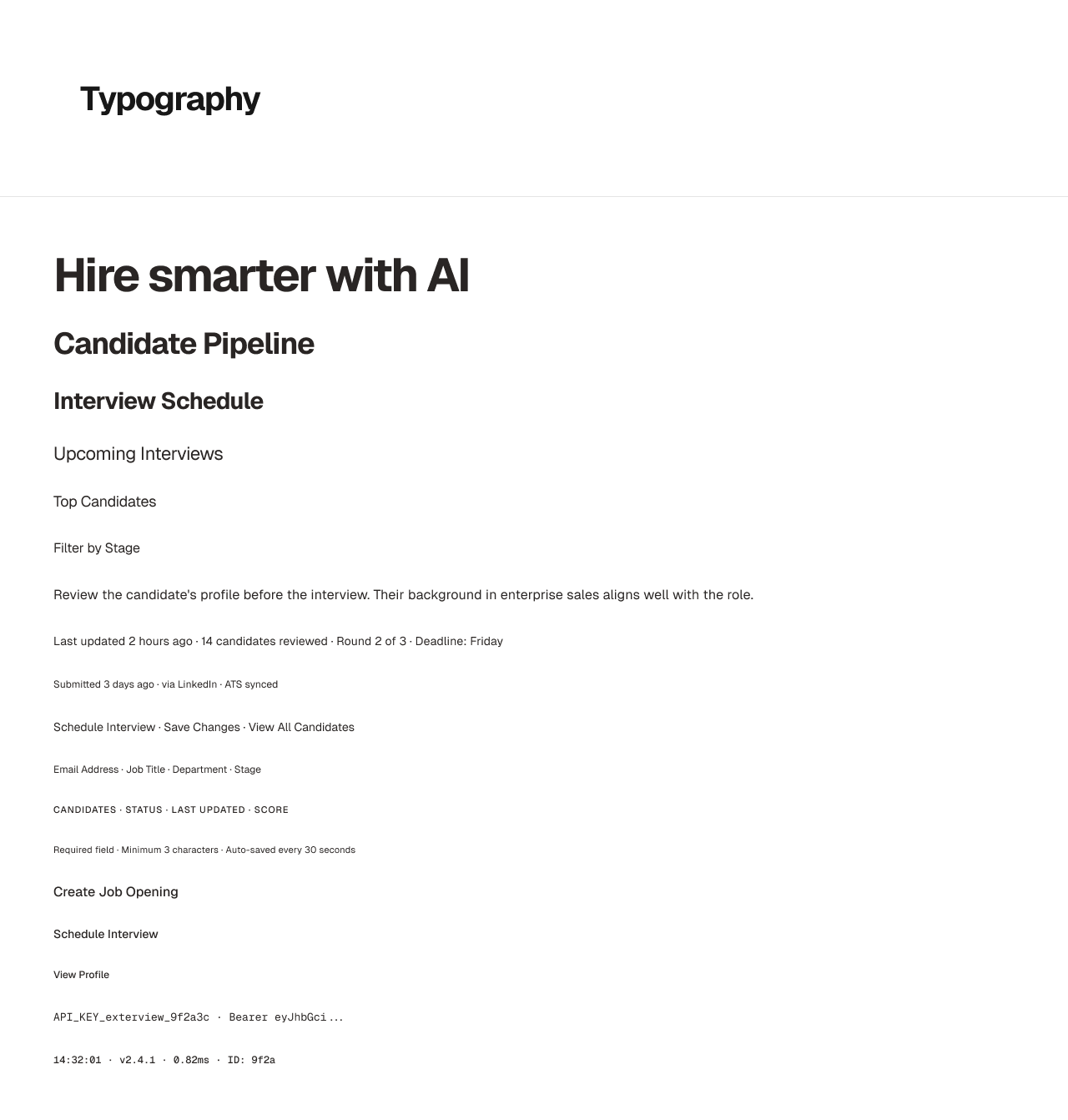
05 / Component logic
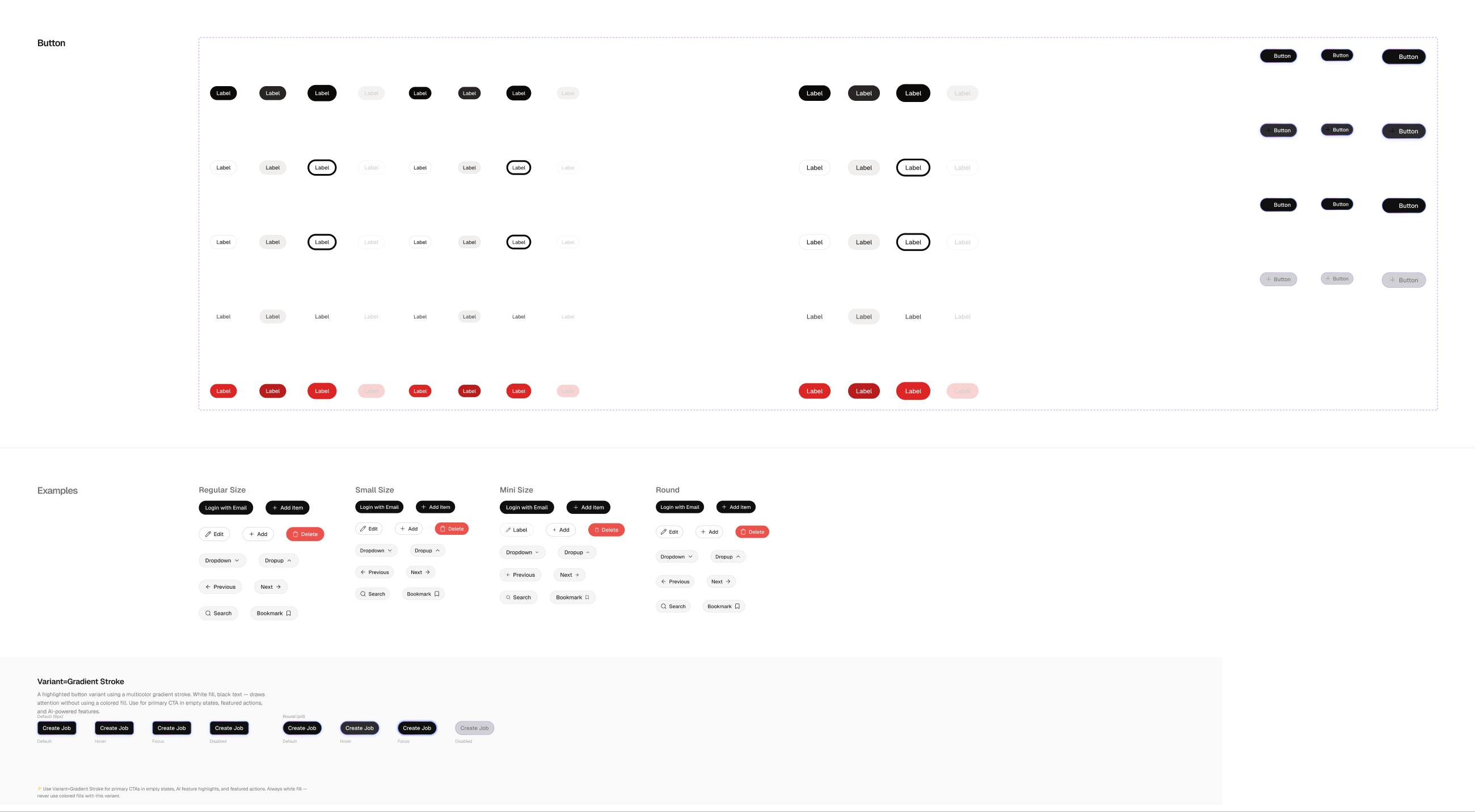
72 variants.
One Button.
The component exposes deliberate choices without exposing its internal construction. Treatment, size, state, icon visibility, and icon swaps are controlled from the instance.
06 / Composable structure
Flexible where
content changes.
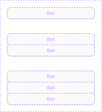
Card uses one, two, or three slots. Header, main, and footer areas are instance swaps, allowing composition without detaching from the system.
- 01 One to three slot layouts
- 02 Header, main, and footer swaps
- 03 Structure stays governed
07 / Component story
9Content types×2Alignments×4States=72Variants
Content changes.
Structure should not.
A dense hiring table may need text, actions, checkboxes, badges, buttons, avatars, names, or inputs without becoming nine unrelated components.
Model the choices,
not every screen.
Content type, alignment, and interaction state become the three deliberate configuration axes.
One predictable
component API.
Seventy-two variants stay inside one component set, so designers choose intent instead of rebuilding table cells.

08 / Data visualization
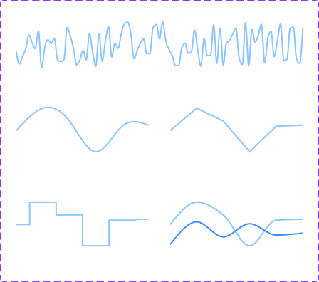
One chart language.
Many data stories.
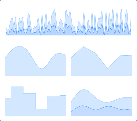
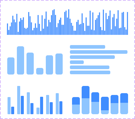
Line, area, and bar components share chart tokens, axis helpers, gridline rules, legends, and five focused color variables.
09 / The library
From Accordion
to Tooltip.
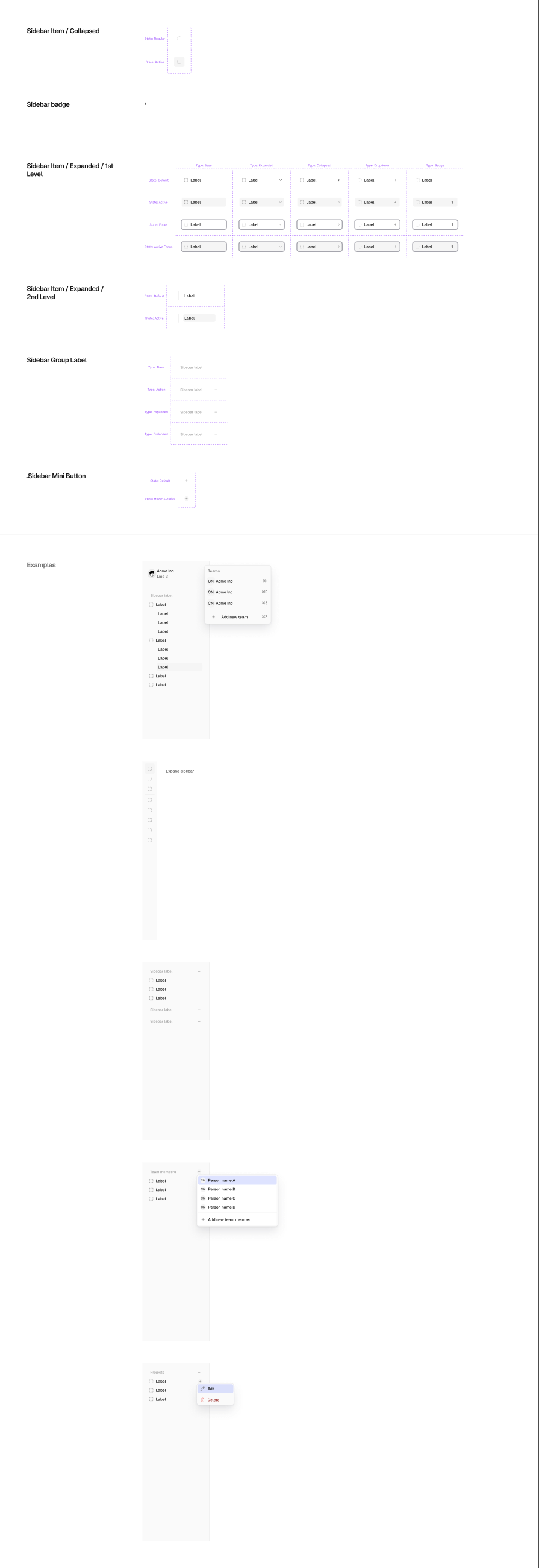
The file is organized as a browsable product library, with dedicated pages for foundations and the interface patterns needed across a complex hiring workflow.
10 / Inside the product
The system should
feel invisible in use.
This chapter is reserved for a walkthrough inside Exterview. The final video will connect tokens, components, and patterns to the real product experience.
Exterview product walkthrough
Video placeholder / 16:9Continue the story